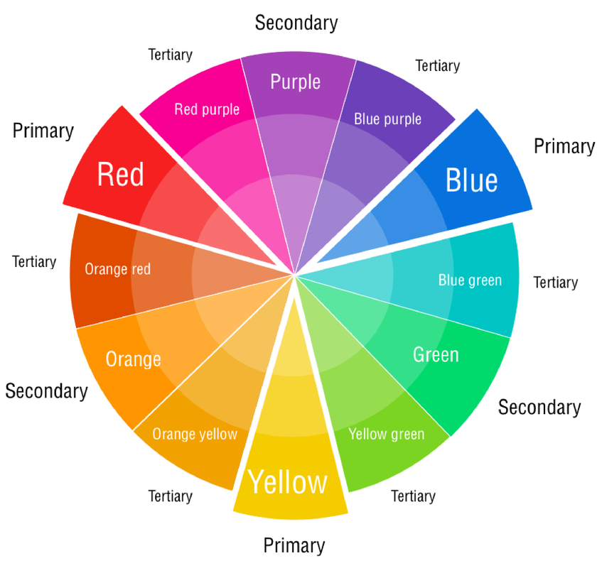
 The Color WheelWhen you're thinking about choosing interior paint colors, it's always a good idea to review a few basic color terms. Finding inspiration from the color wheel can help you imagine your home's color schemes more easily.
The Effects of Color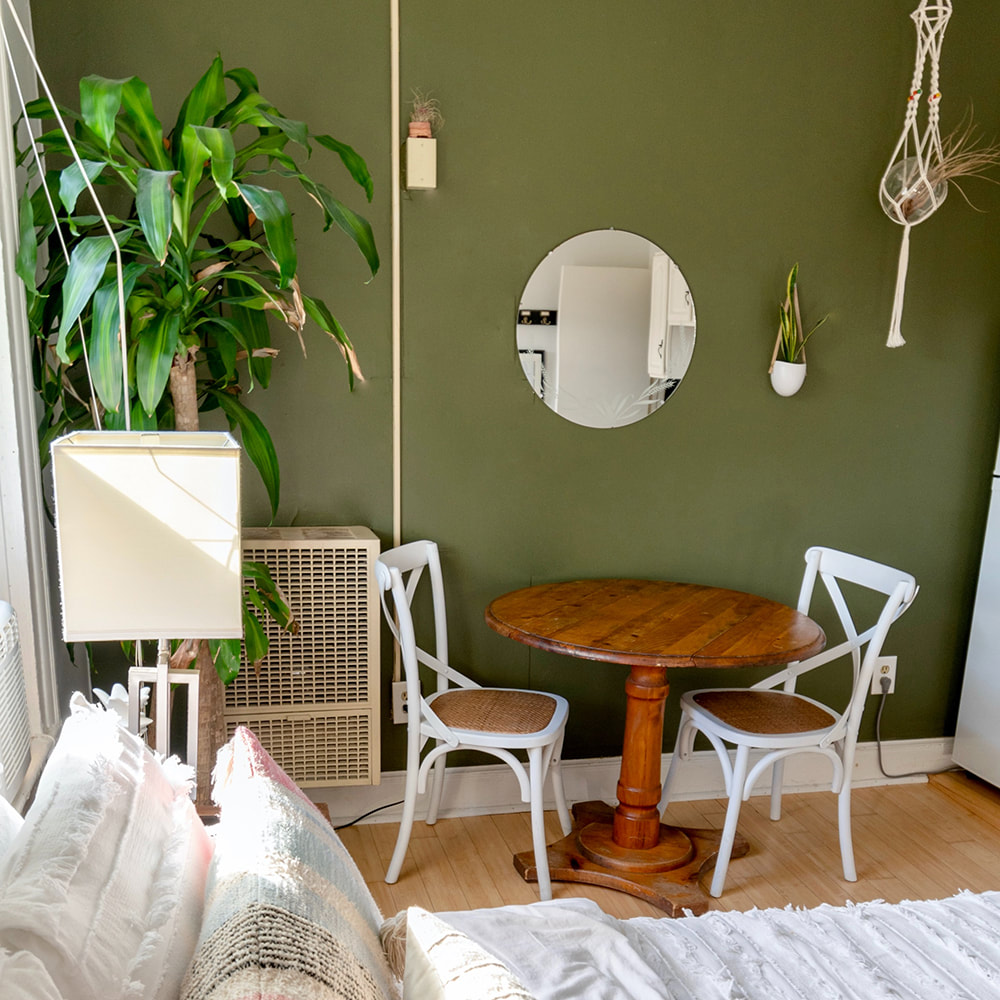 A green room evokes peace and growth. A green room evokes peace and growth. Different color schemes affect our moods in different ways. Knowing more about what each color represents will help you choose the best paint option for every space. Warm and Cozy Colors Warm and cozy colors, located on the right side of the color wheel, convey a message of togetherness and strength:
Cool and Soothing Colors Cool and soothing colors, located on the left side of the color wheel, provide a sense of calm and feelings of trust:
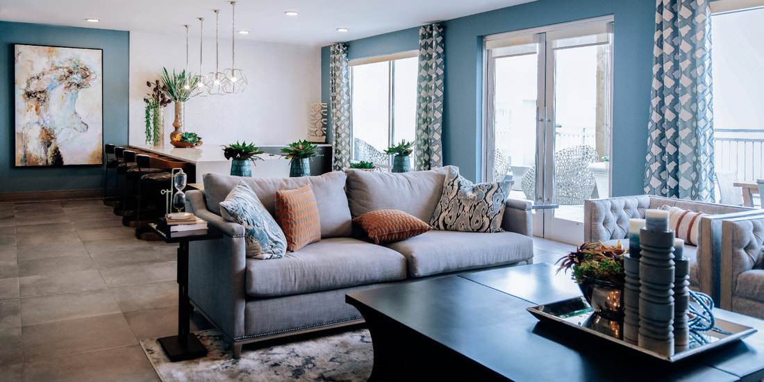
Pastel Colors Pastel colors are created by adding large amounts of white to a saturated hue. They create a comfortable, airy feeling in any room. Neutral Colors Neutral colors include shades of white, beige, taupe, gray and black. Neutral colors are the easiest colors to use because they blend with most surroundings. These colors can also be stylish and dramatic. For instance, black and white are neutral colors that create a wonderful palette for additional colors. If you choose to paint your home with neutral colors, use bold-colored accessories to accent the walls and add visual interest. Choosing a Color Scheme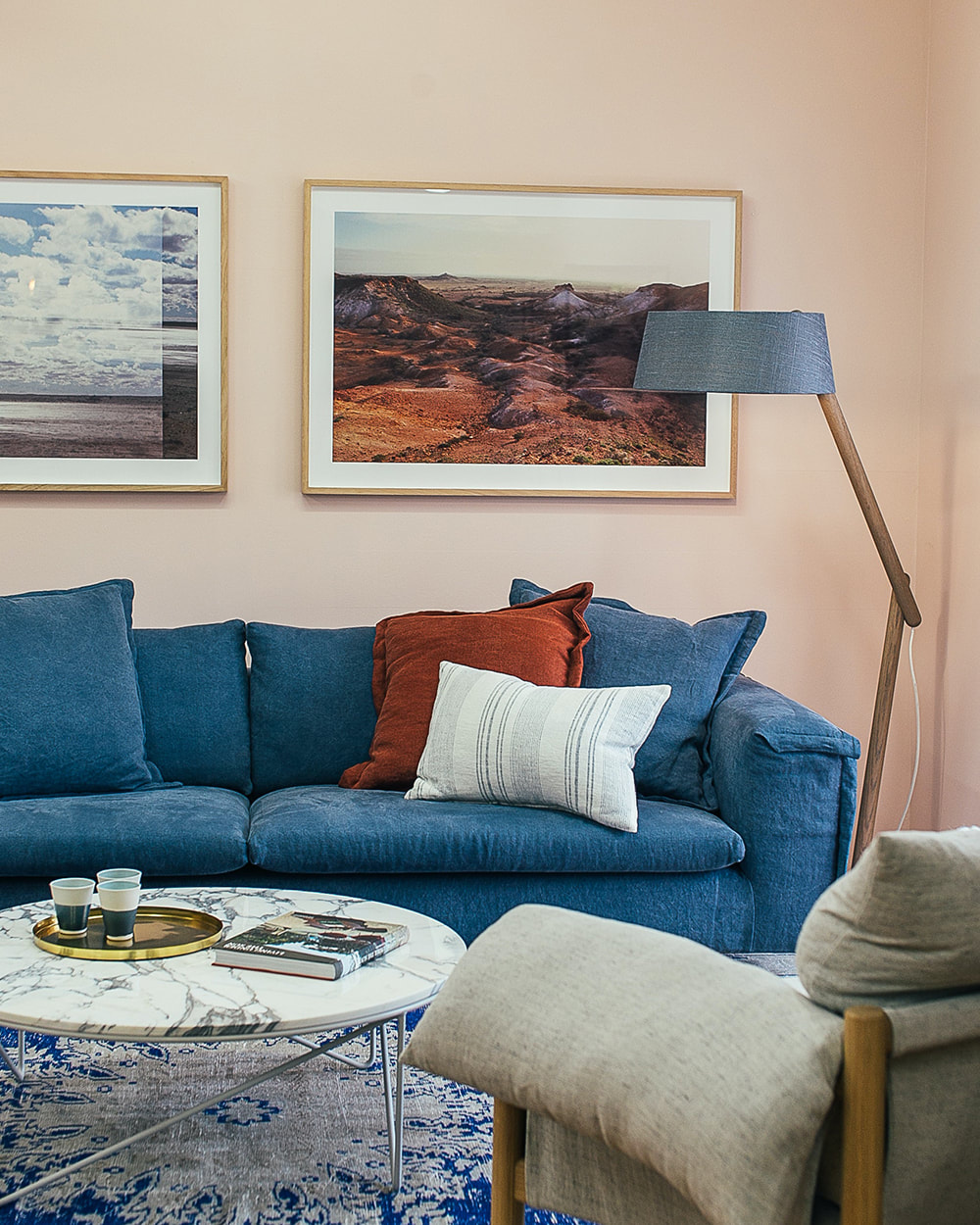 This living room utilizes a orange and blue complementary color scheme. The peachy pastel walls are a great backdrop to the luxurious dark blue sofa and rug. A burnt orange throw pillow helps to tie the entire room together. This living room utilizes a orange and blue complementary color scheme. The peachy pastel walls are a great backdrop to the luxurious dark blue sofa and rug. A burnt orange throw pillow helps to tie the entire room together. A color scheme is any set of colors that work together to create a visually appealing layout. Below are some suggestions, but you can let your imagination run wild. Complementary Colors Complementary colors are located opposite one another on the color wheel. Each color brings out the richness in the other. When using complementary colors, one color should be subtle and the other color should be more dominant. For example, pair an intense violet bedroom wall with a light yellow indoor planter. Split Complementary Colors Split complementary colors offer a daring color palette. Select a main color. Next, find its complementary color, and then select colors from each side of the complementary color. Related Colors Related colors are located next to one another on the color wheel. These colors produce a less contrasted effect than complementary colors. For example, a dark blue-green combined with a light blue can give the feeling of floating in a blue ocean. Monochromatic Colors Monochromatic colors share a hue but have different tones, values and saturation. Picture a paint swatch card: It has different values of one color. Using two or more monochromatic colors, like a black wall paired with white home accents, creates a stylish and modern look. Article adapted from Lowes.com Still need help figuring out your color scheme?
Receive a FREE Color Consultation with any booked job. Contact us for a quote! 1/11/2022 09:14:49 pm
Thanks for pointing out that a neutral color is a good base palette idea that you could apply to your home. My friend talked about how she wants to surprise her husband with a gaming room for his birthday. I think it would be a good plan to have an expert paint his room for an appropriate ambiance! Comments are closed.
|
AuthorWrite something about yourself. No need to be fancy, just an overview. Archives
February 2024
Categories |
Call Us: (610) 696-5016
 RSS Feed